This post was first published at Mother Jones.
With Washington paralyzed on bread-and-butter issues and the midterms ahead, we put together a primer on the state of America’s frozen paychecks. We’ll be posting a new chart every day for the next couple of weeks. Today’s chart: How the recovery left most Americans behind.
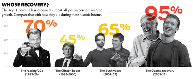
The Great Recession officially ended five years ago, but that’s news for millions of Americans: A stunning 95 percent of income growth since the recovery started has gone to the super wealthy. The top one percent has captured almost all post-recession income growth. Compare that with how they did during these historic booms:
Illustrations and infographic design by Mattias Mackler. (Photos: Warner Bros; Peter Morgan/Reuters; Christoph Dernbach/DPA/ZumaPress; Steve Jennings/Wireimage/Getty Images; Bo Rader/Witchita Eagle/MCT/Getty Images; Kimberly White/Reuters)
Sources: Boom and recovery gains, 1% gains: Emmanuel Saez and Thomas Piketty (Excel); average household income: Census Bureau.