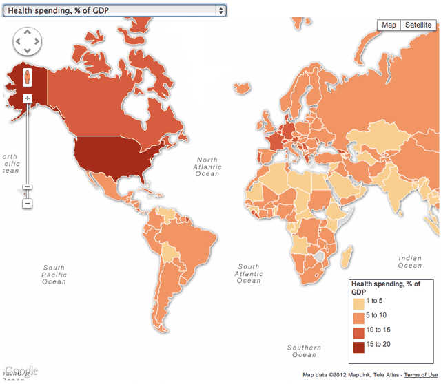
Everybody knows that the United States spends more money on health care than any other country. But how much exactly?
Over the weekend, the UK Guardian posted this interactive map (click to interact) that compares how much each country spends on health care. Find out how the United States’ spending stacks up against other Western nations and the world.
The accompanying article looks at some of the data more closely and observes:
“We took these statistics from the World Health Organisation, which measure spending and medical infrastructure in nearly 200 countries across the globe. They show huge variations in health funding, depending on where you live, although for most countries, people have to pay for healthcare direct…
The US has the highest health spending in the world — equivalent to 17.9 percent of its gross domestic product (GDP), or $8,362 per person. And it’s not all private — government spending is at $4,437 per person, only behind Luxembourg, Monaco and Norway.
Under half of all US health spending is by private companies — 46.9 percent. But it has the highest rate for health insurance in the world — 67.8 percent of all private spending. Which means the rest comes from out of pocket expenses, ie paying for health as you go.”


