Romney’s recent characterization of the mindset of the 47 percent of Americans who don’t pay income taxes has spurred discussion about who pays what, and how income, taxes and entitlements affect American voters’ decisions in the voting booth. And though percentiles have become a trendy way to describe groups of people, they sometimes aren’t as effective in telling the whole story as we might like.
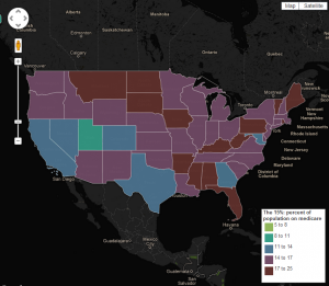
That said, The Guardian‘s Data Blog has a put together an interactive map that attempts to break down America’s 47 percent even further, showing how different groups of Americans are distributed by state: “The US has become a land of percents: the 1 percent versus the 99 percent, the 8 percent unemployed or the 15 percent in poverty,” writes Guardian news editor Simon Rogers. His map groups Americans not just by taxes, employment and poverty; it also shows the seven percent who are veterans, the 15 percent without medical insurance, the 13 percent over 65 years of age.

The Guardian's interactive map of America. Click on the map to go to The Guardian's site to interact.
Some highlights:
– Most of the states with the highest percentage of people without health insurance are in the south – and these same states also have high percentages of residents with no tax liability and residents living in poverty. Most of these states went to John McCain in 2008 – the exceptions are Florida and New Mexico.
– The richest Americans live in California and are clustered in the northeast — in New York, Connecticut, New Jersey and Massachusetts. In 2008, those states all went to Obama.
-Americans receiving Medicare are fairly evenly distributed across the country. The exceptions are Utah and Alaska, which are also America’s most youthful states – only 8 percent of the population of Alaska and 9 percent of the population of Utah is over 65 years old. The states with the most senior citizens are Florida, Maine, Pennsylvania and West Virginia. On average, 13 percent of state populations are over 65.

