Over the summer, designer and blogger Nickolay Lamm re-envisioned New York’s skyline such that the height of buildings represented the wealth of the people who inhabited them.
The art was striking, and exposed the city’s vast inequalities. “I feel a lot of people look at New York’s skyline and think, ‘that’s where dreams happen, that’s where dreams are made,” he says. “I wanted to recreate the skyline to show dreams can happen there, but it’s not as easy as it seems.”
Lamm has just come out with a new set of illustrations visualizing inequality for several other cities, including Chicago, Boston, Miami, San Francisco and Los Angeles.
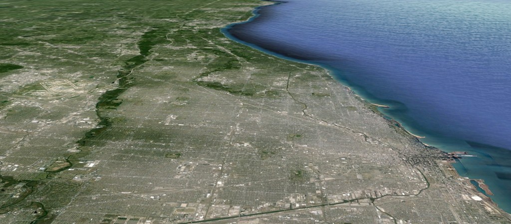
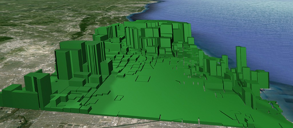
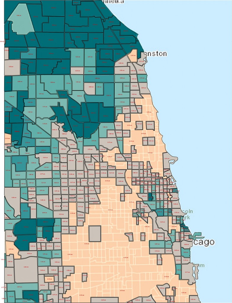
Here’s how his visualization of income inequality works: If one section of a city had a net worth for example of $500,000, the height of the green 3D bar shape for that section is 5 cm. If one section had a net worth of $112,000, the height for that section is smaller at 1.12 cm.
Lamm’s method reveals striking divides within cities. In his visualization of Chicago above, for instance, one can see wealth clustered along the shore of Lake Michigan and in the suburbs to the west, but not in between.
Here’s another map by Lamm that shows the same phenomenon. The dark green areas represent those areas with the highest wealth, similar to the soaring green bars in the previous image.
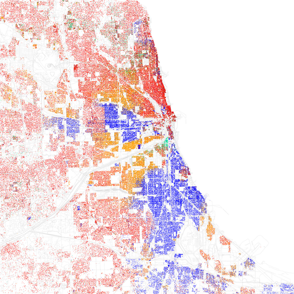
Compare the image above with the map below of race in Chicago, created by Eric Fisher based on 2010 Census data.
In the map of race, each dot equals 25 residents — a red dot is 25 white residents, a blue dot is 25 black residents, green is asian, orange is hispanic, yellow is “other.” When comparing the two maps, we can see that the orange areas on Lamm’s map of Chicago — representing his lowest bars — are in primarily black and Latino neighborhoods identified on Fisher’s map.
While income inequality may be invisible, our cities have very real divides along other observable lines. Still, these disparities go unaddressed.
“It’s not meant to be a depressing project,” Lamm says. Instead, Lamm says he wants to increase awareness of a major urban problem. “A few of the most powerful people in these cities say that everything is fair. They do that to keep people settled down. The ones who promote the American dream the most are the ones who really don’t care about it — they’re promoting it to save their own self interests.”
See all of Lamm’s inequality visualizations of cities here:


