New York is the most unequal of America’s largest cities. Within ten miles — or a half-hour subway ride — of Wall Street, median household income for a census tract can fluctuate by a factor of greater than ten, from more than $200,000 annually to less than $20,000. This is the median income for a neighborhood — not the extremes. “According to recent data from the U.S. Census Bureau,” the New Yorker noted in April, “if the borough of Manhattan were a country, the income gap between the richest twenty per cent and the poorest twenty per cent would be on par with countries like Sierra Leone, Namibia and Lesotho.”
New York’s gap is an archetype of a national trend. Bill Moyers and Michael Winship wrote last fall:
The new Gilded Age is roaring down on us – an uncaged tiger on a rampage. Walk out to the street in front of our office here in Manhattan, look to the right and you can see the symbol of it: a fancy new skyscraper going up two blocks away. When finished, this high rise among high rises will tower a thousand feet, the tallest residential building in the city.
The New York Times has dubbed it “the global billionaires’ club” — and for good reason. At least of two of the apartments are under contract for more than $90 million each.
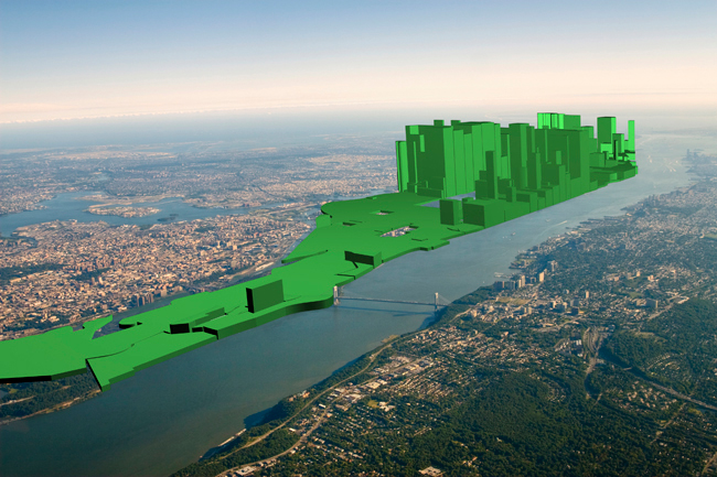
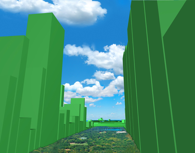
Graphic artist and researcher Nickolay Lamm re-envisioned New York’s skyline with wealth represented by towering skyscrapers (not unlike our plutocratic office-neighbors’ imposing new home). He drew his information from this also-very-interesting map of median net worth across America. The results are impressive.
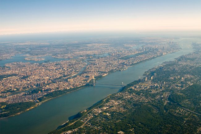
Looking south down the Hudson River at Manhattan:


Looking north from the bottom of Central Park, toward Harlem:


In a blog post, Lamm explains how these images were made:
If one section had a net worth of $500,000, the height of the 3D bar shape for that section was 5 cm. If one section had a net worth of $112,000, the height for that section was 1.12 cm. For some sections, we grouped the average height of the sections, and made one larger bar graph that encompassed multiple areas.

