
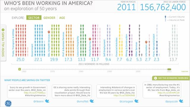
Today’s beautiful smart chart takes a look at America’s workforce and how it has changed over the past 50 years. It was produced by GE and the design firm Periscopic.
Hit the play button and watch the percentages of people working in the manufacturing, education, government and other sectors rise and fall. Red flags reveal more information — in 2011, for example, only 2.7 percent of Americans work in the information sector, making them almost as rare as farmers. Possible tweet: “If we are a culture of information, how could information jobs make up only 2 percent of the workforce?”
You can also explore by gender and age. As you might expect, the percentage of women in the workforce has increased dramatically: only 22 percent of women worked in 1960 and over 66 percent had jobs in 2011. Slightly more surprising (and somewhat depressing also) is the number of older workers (55+) now participating in the workforce, 35 percent, versus only 13 percent in 1960.
Take a look at the chart and tell us — or tweet #workinginamerica — what surprises you.
Source: Bureau of Labor Statistics. More information at GE website.