

Tree tagged in Brooklyn as part of New York City's "One in a million" tree program.
The poet Joyce Kilmer once wrote: “I think that I shall never see. A poem lovely as a tree.” Trees in urban settings are more than just lovely, they actually clean the air, reduce noise pollution, reduce the need for air conditioning in the summer and work against the greenhouse effect. They even reduce stress. And according to blogger Tim De Chant, they also prove to be a good indicator of income inequality as viewed from space.
A few weeks ago De Chant wrote in his blog, Per Square Mile, about a research paper he had come across that presented some interesting findings. De Chant explained it in his post:
“[F]or every 1 percent increase in per capita income, demand for forest cover increased by 1.76 percent. But when income dropped by the same amount, demand decreased by 1.26 percent. That’s a pretty tight correlation. The researchers reason that wealthier cities can afford more trees, both on private and public property. The well-to-do can afford larger lots, which in turn can support more trees. On the public side, cities with larger tax bases can afford to plant and maintain more trees.”
It got De Chant thinking about whether it would be possible to actually see income inequality from space. So he did some googling. And he found that not only was it very easy to spot in cities across the United States, it was also evident in cities around the globe. See for yourself. The first image of each set is the lower income neighborhood.
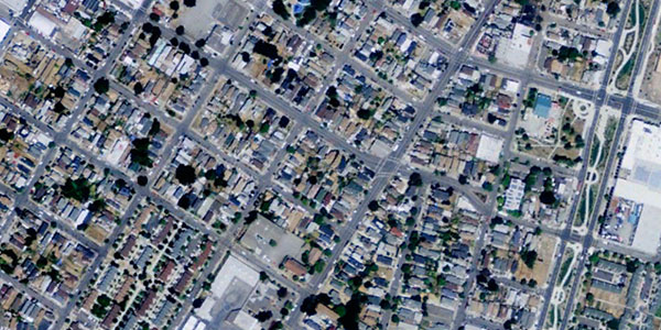
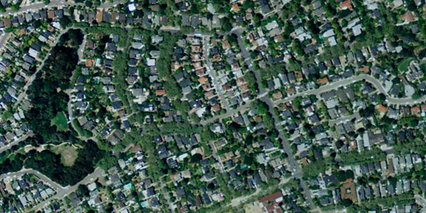
Oakland, California
West Oakland
Piedmont
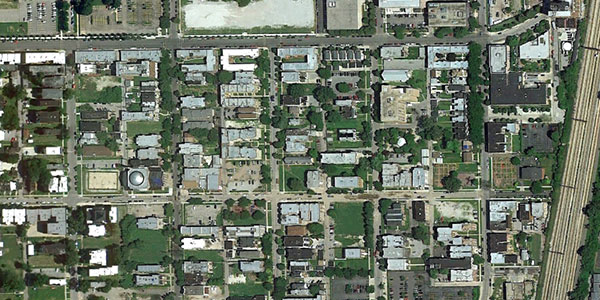
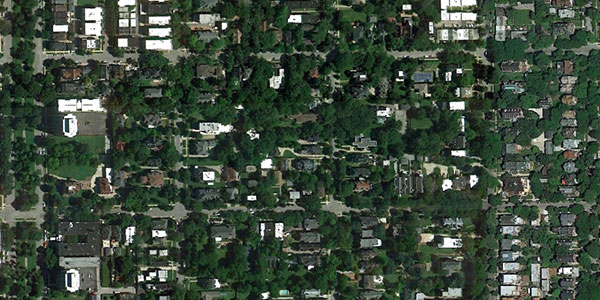
Chicago, Illinois
Woodlawn
Hyde Park
You can see more images from Boston, Houston, Beijing and Rio de Janeiro on De Chant’s blog post or look up neighborhoods in your own city using Google maps.
De Chant points out that the differences weren’t as stark in U.S. cities with tree programs in place, such as New York City which is working to double its number of trees to 1 million in 10 years. Chicago has planted over 600,000 in the last 20 years (although De Chant notes that number may include replacement trees) and London is planting 20,000 new trees for the Olympics.
De Chant asked readers to send him pictures of their cities. We emailed him to see what kind of response he’s received. He writes:
“I was surprised at first by the enormity of the response, but after thinking about it, it makes sense. Income inequality is typically an amorphous concept, not something that can be easily visualized. Tree cover in cities, on the other hand, is immediately recognizable. That allows people to go to Google maps and, with the knowledge they have of their own city, pick out neighborhoods that are rich or poor and see if the trend holds in their city. And for most people I’ve heard from, it has.
I’ve literally received hundreds of emails and comments from people pointing out income inequality in their own city. People from around the world. There will of course always be outliers, but I think this has really struck a nerve because it’s income inequality laid bare, in people’s own cities.”
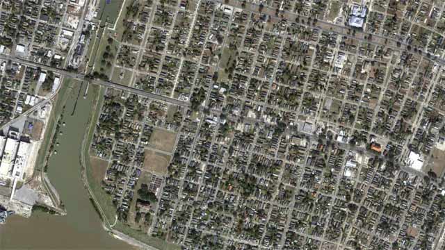
Ninth Ward, New Orleans, LA
There was, however, one countertrend. De Chant observes that extreme poverty and and extreme wealth often look the same from space.
“[P]arts of Detroit or New Orleans that have been through really tough times have reverted back to more greenery. As houses have been torn down, the land has returned to a wilder state, ironically making it appear in satellite photos to be more similar to wealthy areas than poor ones. Vegetation and income inequality run on a circular spectrum, I guess, with areas of extreme poverty nearly indistinguishable in satellite photos from areas of extreme wealth.”
Share your images with us on Flickr by tagging them “tree income inequality.”