Smart Charts
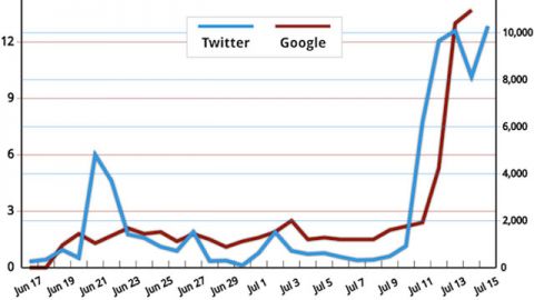
- July 18, 2012Voters aren’t just passively watching the Obama campaign’s ads attacking Mitt Romney’s career at Bain Capital.
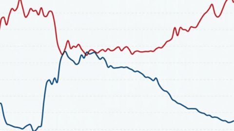
- July 3, 2012This chart shows how the decline in labor membership corresponds to the rise of the one percent.
- July 3, 2012Americans spend more than any other country on healthcare — nearly $8,500 per person. Find out how the we compare to other Western countries and the world.
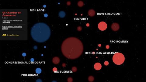
- June 28, 2012Mother Jones new interactive lets you explore the universe created by Citizens United (also known as the big bang).
- June 27, 2012If you're prepping for tomorrow's Supreme Court decision on the Affordable Care Act, this smart chart provides a good overview of possible outcomes.
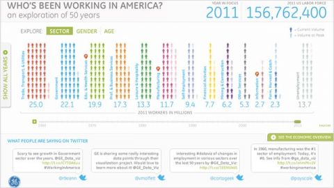
- June 18, 2012In 1960, the largest number of jobs in the U.S. were manufacturing jobs. Today the sector ranks sixth. Find out what else has changed.
- June 14, 2012A new Gallup poll reports that 68 percent of Americans still blame President Bush for the bad economy.
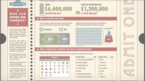
- June 13, 2012Learn how much it takes to get elected to Congress in this infographic from GOOD magazine and Rootstrikers.
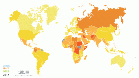
- June 12, 2012The sixth edition of the Global Peace Index was released today. The study ranks 158 countries by a number of factors such as overall safety and militarization.
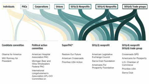
- June 6, 2012There are still some rules regarding political campaign donations. This beautiful infographic from NPR's election team breaks it down.

