Last week, we took a look at the growing inequality in Silicon Valley with five charts that show the hollowing out of the middle class and growing poverty rates in that region.
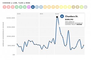
And today, we came across this smart chart on Facebook. It’s the coolest infographic we’ve seen in a long time. The New Yorker staff took the most recent data from the U.S. Census Bureau and mashed it up with NYC subway stops so you can see the median income of people living along a train’s route. It’s a fascinating look at the income disparities among NYC neighborhoods.
Some highlights from The New Yorker:$205,192—The highest median household income of any census tract the subway has a station in (for Chambers Street, Park Place, and World Trade Center, all in Lower Manhattan).
$12,288—The lowest median household income (Sutter Avenue, on the L in Brooklyn).
$142,265—The largest gap in median household income between two consecutive subway stations on the same line (between Fulton Street and Chambers Street on the A and the C lines, in Lower Manhattan).


